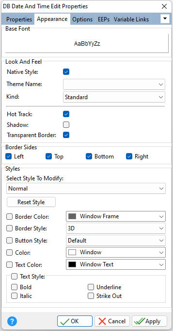
ð Base Font Specifies the font style, size and color for the control
ð Look and Feel Native Style Specifies whether the control will look like a native Windows object. Note: The Native Style has higher priority than the Kind property. Thus, if the Native Style is set, the Kind property has no effect. Theme Name Specifies a theme to display an artistic representation over the control objects, which enhance the visual display. Note: The Theme Name has higher priority than the Kind property. Kind Specifies the look of the control and how the control visually responds on user actions (focus, mouse move, clicks etc.). Basically Kind determines how the control is painted. Hot Track Specifies whether the control is highlighted when the mouse is positioned over the control Shadow Specifies whether to display a shadow for the control Transparent Border Specifies whether the control border is transparent
ð Border Sides Specifies which sides of the border are visible
ð Styles - customizes the appearance of control elements based upon the status, where each status (normal, disabled, focused, and hot) has its own style properties Select Style To Modify Specifies the status to modify Reset Style Resets the status style to the default Border Color Specifies the border color for the control's status Border Style Specifies the border style for the control's status •None - no borders are drawn around the control. However, when the mouse cursor is positioned over the control or the control has focus, the borders are drawn flat. •Single - has thin borders. When the mouse cursor is positioned over the control or the control has focus, the control has thick borders. •Thick - borders are always thick, i.e. the mouse position has no effect •Flat borders are flat. When the mouse cursor is positioned over the control or the control has focus, the borders appear three-dimensional. •3D - appears three-dimensional and the mouse position has no effect •UltraFlat - borders have an Office XP style. The control borders and buttons are highlighted when the mouse is moved over the control. •Office11 - borders have an Office 2003 style. The control borders and buttons are highlighted when the mouse is moved over the control. Button Style Specifies the button style for the control's status •Default - style is determined by the border style of the editor which is set via the Border Style property. •3D - appears three-dimensional. It is not highlighted when the mouse cursor is positioned over it. •Flat - appears flat with a slight three-dimensional effect. It is not highlighted when the mouse cursor is positioned over it. •Simple - normally appears without borders. It is displayed with the Flat effect when the mouse cursor is positioned over it. •Hot Flat - appears flat with a thin border. It is highlighted when the mouse cursor is positioned over it. •UltraFlat - has an Office XP style. It appears flat without borders and is highlighted when the mouse cursor is positioned over it. •Office11 - has an Office 2003 style. It appears flat without borders and is highlighted when the mouse cursor is positioned over it. Color Specifies the background color for the control's status Text Color Specifies the text color for the control's status Text Style Specifies the text style control's status
|
|
