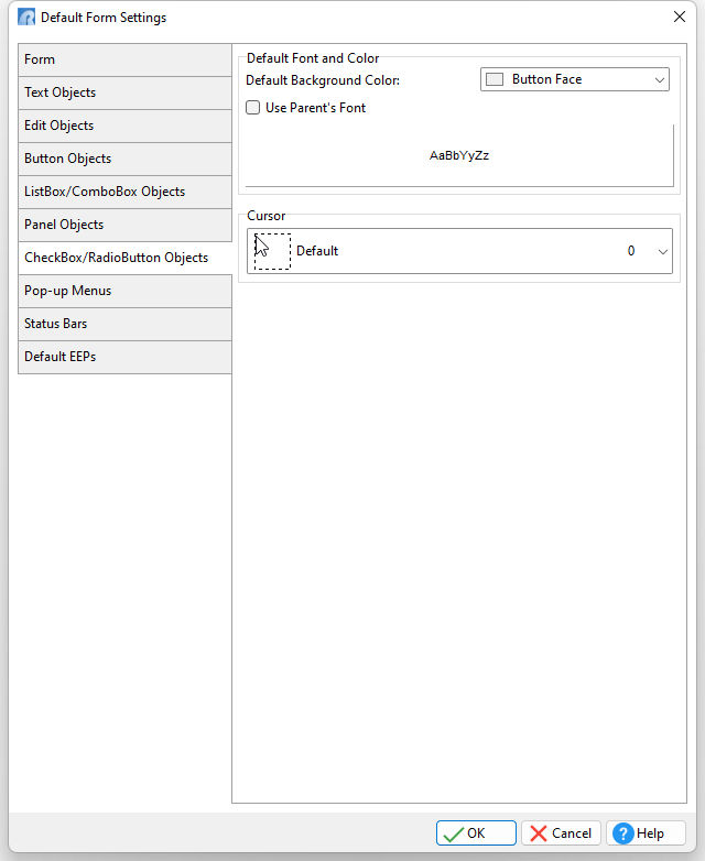
ð Default Font and Color Color Specifies the background color of the object Use Parent's Font Specifies to use the font for the control's parent object/control AaBbYyZz Specifies the font style, size and color for the object
ð Cursor Specifies the visual representation of the mouse cursor as it hovers over any of your CheckBox/RadioButton objects.
|
|