
The control places an object which can be used as a container for grouping other controls, with an available caption.
Tip! - A Group Box control can be converted to an Enhanced Group Box control. Within the Form Designer, right click on the Group Box and select the "Convert to Enhanced Group Box " option.
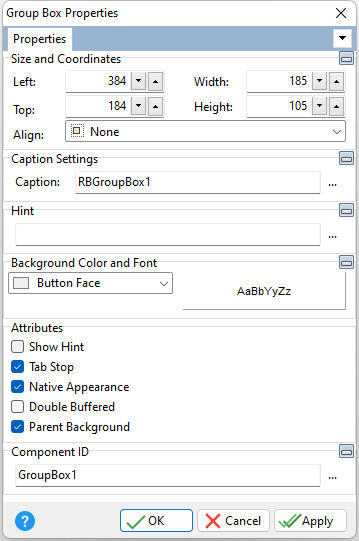
ð Size and Coordinates Left Specifies the left (horizontal) ordinate pixel of the object Top Specifies the top (vertical) ordinate pixel of the object Width Specifies the object width, in pixels Height Specifies the object height, in pixels Align Specifies the alignment of the object. The options are: None - Object can be moved anywhere because it is not aligned to the parent object Client - Aligns itself to the available client area by expanding to fill the parent object that it is in Left - Aligns itself to the left side of the parent object growing or shrinking to match parent height Right - Aligns itself to the right side of the parent object growing or shrinking to match parent height Top - Aligns itself to the top side of the parent object growing or shrinking to match parent width Bottom - Aligns itself to the bottom side of the parent object growing or shrinking to match parent width
ð Caption Settings Caption Value which the object will display when the form is run
ð Hint Value which will display when the object is hovered over by the mouse cursor
ð Background Color and Font Specifies the background color of the object AaBbYyZz Specifies the font style, size and color for the object
ð Attributes Show Hint Displays the defined hint Tab Stop Determines whether or not field is part of tab order and user is able to land on this field Native Appearance Specifies to display the control where the appearance will be rendered by the operating system Double Buffered Specifies to reduce painting operations (flickering) for the control background by storing an internal bitmap image Parent Background Forces the control to follow the color attributes of its parent control, working like a transparency, in taking the parent object as the background
ð Component ID Unique identifier used when passing property parameters in statements
See also:
|
|