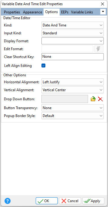
ð Date/Time Editor Kind Specifies the kind of the drop down calendar (Date or Date and Time) to display Input Kind Specifies how user input is validated •Standard - no validation, but supports Smart Input Strings •Input Mask - validation by format, which is obtained from the operating system defined format •Regular Expression - validation using regular expressions. The validation format is obtained from the Edit Format value, and supports Smart Input Strings. Display Format Specifies the manner in which the value is formatted when not focused Edit Format Specifies a regular expression characters string to define a search pattern, which can be used to validate user input. A button is available to validate the regular expression. Clear Shortcut Key Specifies the keyboard shortcut to clear the control Left Align Editing Specifies the alignment when editing the value with the calendar and clock objects. Set the value to unchecked (false) so editing follows the display alignment setting.
ð Other Options Horizontal Alignment Specifies the horizontal justification of the text within the control Vertical Alignment Specifies the vertical justification of the text within the control Drop Down Button Specifies a image to display for the calendar button, which can be loaded, deleted, and previewed Button Transparency Specifies the transparency for the buttons Popup Border Style Specifies the border style for the calendar
|
|
