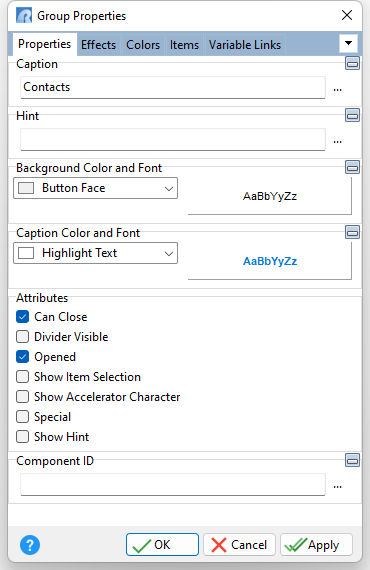
ð Caption Value which the object will display when the form is run
ð Hint Value which will display when the object is hovered over by the mouse cursor
ð Background Color and Font Color Specifies the background color of the object AaBbYyZz Specifies the font style, size and color for the object
ð Caption Color and Font Color Specifies the background color of the object AaBbYyZz Specifies the font style, size and color for the object
ð Attributes Can Close Specifies if the group can be closed Divider Visible Displays a divider between the group caption and list of items Opened Displays the group opened when the form launches Show Item Selection Highlights the selected item based on the "Item Selection Style" Show Accelerator Character If unchecked, the text will show the ampersand (&) symbol as opposed to underscoring the next character for a keyboard shortcut Special Applies a reverse visual style to the group Show Hint Displays the defined hint
ð Component ID Unique identifier used when passing property parameters in statements |
|
