Tip! - A Tab Control can be converted to an Enhanced Tab Control. Within the Form Designer, right click on the Tab Control and select the "Convert to Enhanced Tab Control" option.
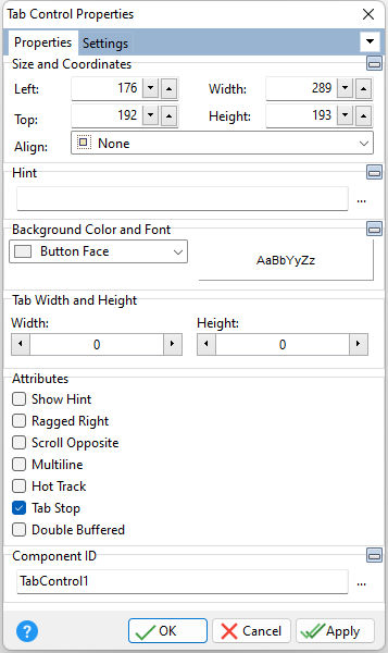
ð Size and Coordinates Left Specifies the left (horizontal) ordinate pixel of the object Top Specifies the top (vertical) ordinate pixel of the object Width Specifies the object width, in pixels Height Specifies the object height, in pixels Align Specifies the alignment of the object. The options are: None - Object can be moved anywhere because it is not aligned to the parent object Client - Aligns itself to the available client area by expanding to fill the parent object that it is in Left - Aligns itself to the left side of the parent object growing or shrinking to match parent height Right - Aligns itself to the right side of the parent object growing or shrinking to match parent height Top - Aligns itself to the top side of the parent object growing or shrinking to match parent width Bottom - Aligns itself to the bottom side of the parent object growing or shrinking to match parent width
ð Hint Value which will display when the object is hovered over by the mouse cursor
ð Background Color and Font Specifies the background color of the object AaBbYyZz Specifies the font style, size and color for the object
ð Tab Width and Height Width Width, in pixels, of the page tab Height Height, in pixels, of the page tab
ð Attributes Show Hint Displays the defined hint Ragged Right Used to set whether rows of tabs stretch to fill the width of the control Scroll Opposite Determines where previous rows of tabs in a multi-line tab control move when the user selects a tab in another row. When Scroll Opposite is True, previous rows of tabs are moved to the bottom of the tab control if Tab Position is Top, or to the top if Tab Position is Bottom. When Scroll Opposite is False, previous rows of tabs are moved to the back of all other rows of tabs. Multiline Wraps page tabs if they exceed the width of the object Note: Setting ScrollOpposite to True automatically sets the Multiline property to True. Hot Track Tab caption changes color when object is hovered over by the mouse Tab Stop Determines whether or not field is part of tab order and user is able to land on this field Double Buffered Specifies to reduce painting operations (flickering) for the control background by storing an internal bitmap image
ð Component ID Unique identifier used when passing property parameters in statements |
Scroll Opposite Example With a tab control with three rows of tabs at the top, if the user selects a tab in the second row, Scroll Opposite determines where the first row moves. If Scroll Opposite is True, the second row now appears at the front (bottom) row on top of the tab control, followed by the third row behind (above) it. The first row moves to the bottom of the tab control. If ScrollOpposite is False, the first row moves to the back (top), so that the tab control displays the second row in front (at the bottom of the tab region), followed by the third row (now in the middle), followed by the first row.
|