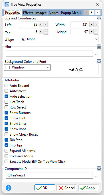
ð Size and Coordinates Left Specifies the left (horizontal) ordinate pixel of the object Top Specifies the top (vertical) ordinate pixel of the object Width Specifies the object width, in pixels Height Specifies the object height, in pixels Align Specifies the alignment of the object. The options are: None - Object can be moved anywhere because it is not aligned to the parent object Client - Aligns itself to the available client area by expanding to fill the parent object that it is in Left - Aligns itself to the left side of the parent object growing or shrinking to match parent height Right - Aligns itself to the right side of the parent object growing or shrinking to match parent height Top - Aligns itself to the top side of the parent object growing or shrinking to match parent width Bottom - Aligns itself to the bottom side of the parent object growing or shrinking to match parent width
ð Hint Value which will display when the object is hovered over by the mouse cursor
ð Background Color and Font Specifies the background color of the object AaBbYyZz Specifies the font style, size and color for the object
ð Attributes Auto Expand Specifies whether the nodes in the tree view automatically expand and collapse depending on the selection Autoselect Specifies that entire field will be selected (highlighted) when user land on this field Hide Selection Specifies if selected text within the control remains "highlighted" when focus is moved to another control. If True, the selected node is not visually distinct from other nodes until focus returns to the control. If False, the node always appears selected. Hot Track Item caption changes color when object is hovered over by the mouse Row Select Set Row Select to True to cause the entire row of the selected item to be highlighted Show Buttons If Show Buttons is True, a button will appear to the left of each parent item. The user can click the button to expand or collapse the child items as an alternative to double-clicking the parent item. Show Hint Displays the defined hint Show Lines If Show Lines is True, lines linking child nodes to their parent nodes are displayed. Nodes at the root of the hierarchy are not automatically linked. To link nodes at the root, the Show Root property must also be set to True. Show Root To show lines connecting top-level nodes to a single root, set the tree view's Show Root and Show Lines properties to True Show Check Boxes Specifies if a check box column is displayed at the far left of the list Tab Stop Determines whether or not field is part of tab order and user is able to land on this field Info Tips Displays the folder or root name if the text value exceeds the control width Expand All Items Expands all nodes when the form opens Exclusive Mode Displays only one node at a time within the control Execute Node EEP On Tree View Click Specifies the nodes EEP is fired when the Tree View is clicked. The behavior for the property is related to Tree Views where "Hide Selection" is unchecked, and the node highlighting appears to be incorrect when a form is launched in the foreground.
ð Component ID Unique identifier used when passing property parameters in statements |
|