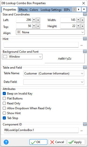
ð Size and Coordinates Left Specifies the left (horizontal) ordinate pixel of the object Top Specifies the top (vertical) ordinate pixel of the object Width Specifies the object width, in pixels Height Specifies the object height, in pixels Align Specifies the alignment of the object. The options are: None - Object can be moved anywhere because it is not aligned to the parent object Client - Aligns itself to the available client area by expanding to fill the parent object that it is in Left - Aligns itself to the left side of the parent object growing or shrinking to match parent height Right - Aligns itself to the right side of the parent object growing or shrinking to match parent height Top - Aligns itself to the top side of the parent object growing or shrinking to match parent width Bottom - Aligns itself to the bottom side of the parent object growing or shrinking to match parent width
ð Hint Value which will display when the object is hovered over by the mouse cursor
ð Background Color and Font Color Specifies the background color of the object AaBbYyZz Specifies the font style, size and color for the object
ð Table and Field Table Name Specifies the table that the control is associated with Data Field Specifies the column that the control will receive its data from
ð Attributes Beep on Invalid Key Sounds a beep when an invalid match is found for the pressed key Flat Buttons Displays flat buttons on the control Read Only Restricts the user from making any changes to the current value. The field is still part of tab order. Allow Dropdown When Read Only Allows the dropdown menu to be accessed, even if the value is read only Show Hint Displays the defined hint Tab Stop Determines whether or not field is part of tab order and user is able to land on this field
ð Component ID Unique identifier used when passing property parameters in statements |
|
