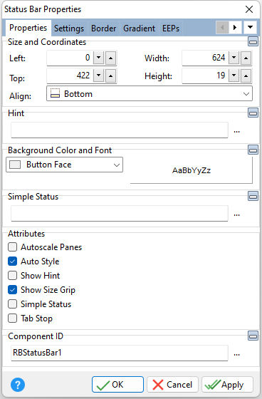
ð Size and Coordinates Left Specifies the left (horizontal) ordinate pixel of the object Top Specifies the top (vertical) ordinate pixel of the object Width Specifies the object width, in pixels Height Specifies the object height, in pixels Align Specifies the alignment of the object. The options are: None - Object can be moved anywhere because it is not aligned to the parent object Client - Aligns itself to the available client area by expanding to fill the parent object that it is in Left - Aligns itself to the left side of the parent object growing or shrinking to match parent height Right - Aligns itself to the right side of the parent object growing or shrinking to match parent height Top - Aligns itself to the top side of the parent object growing or shrinking to match parent width Bottom - Aligns itself to the bottom side of the parent object growing or shrinking to match parent width
ð Hint Value which will display when the object is hovered over by the mouse cursor
ð Background Color and Font Specifies the background color of the object AaBbYyZz Specifies the font style, size and color for the object
ð Simple Status Value that will be displayed by enabling the "Simple Status" check box
ð Attributes Autoscale Panes Automatically scales panes in the status bar Auto Style Automatically adjusts borders and height Show Hint Displays the defined hint Show Size Grip Displays the resize grip on the bottom right corner of form in the Status Bar Simple Status Enables the "Simple Status" field to be displayed on the Status Bar Tab Stop Determines whether or not field is part of tab order and user is able to land on this field
ð Component ID Unique identifier used when passing property parameters in statements |
|