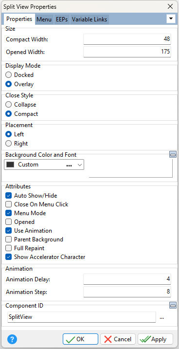
ð Size Compact Width Specifies the object width when compacted/closed, in pixels Opened Width Specifies the object width when opened, in pixels
ð Display Mode Specifies the method for the opened behavior Docked - the control is docked to the left or right edge of the form, and when opened, the client area is reduced by the width of the control Overlay - when expended, the control displays on top of the client area of the form
ð Close Style Specifies the appearance of the control when closed Collapse - specifies the control is completely hidden. The "Auto Show/Hide" attribute will not be recognized when set to Collapse. The control must be manually opened/closed using the OPENED property (e.g. PROPERTY SplitView1 OPENED 'TRUE' or PROPERTY SplitView1 OPENED 'FALSE') Compact - specifies the width of the control, when closed, is equal to the Compact Width value
ð Placement Left - places the split view on the left side of the form Right - places the split view on the right side of the form
ð Background Color and Font Specifies the background color of the panel AaBbYyZz Specifies the font style, size and color for the panel
ð Attributes Auto Show/Hide Expands/closes the split view when the mouse cursor enters/leaves the area. The setting is ignored when Close Style is set to Collapse. Close On Menu Click Closes the menu if the mouse button is clicked Menu Mode In Menu Mode the control displays the menu items. Otherwise, the control acts as a container control, similar to the Collapse Panel. The control can still parent other controls even in Menu Mode. Opened Displays the split view as opened by default Use Animation Uses a gradual expanding/collapsing behavior Parent Background Forces the control to follow the color attributes of its parent control, working like a transparency, in taking the parent object as the background Full Repaint Determines how the split view panel repaints itself when it is resized. When Full Repaint is checked/true, the entire panel, including the beveled border repaints when the size changes. When Full Repaint is unchecked/false, only the area inside the beveled border repaints. Show Accelerator Character Specifies if the captions will show the ampersand (&) symbol as opposed to underscoring the next character
ð Animation Animation Delay Specifies the time interval in milliseconds taken to display the speed of the animation. The smaller the Animation Delay value, the faster the animation. Animation Step The number of pixels by which the width of the control is adjusted during each step of the opening and closing animation.
ð Component ID Unique identifier used when passing property parameters in statements |
|