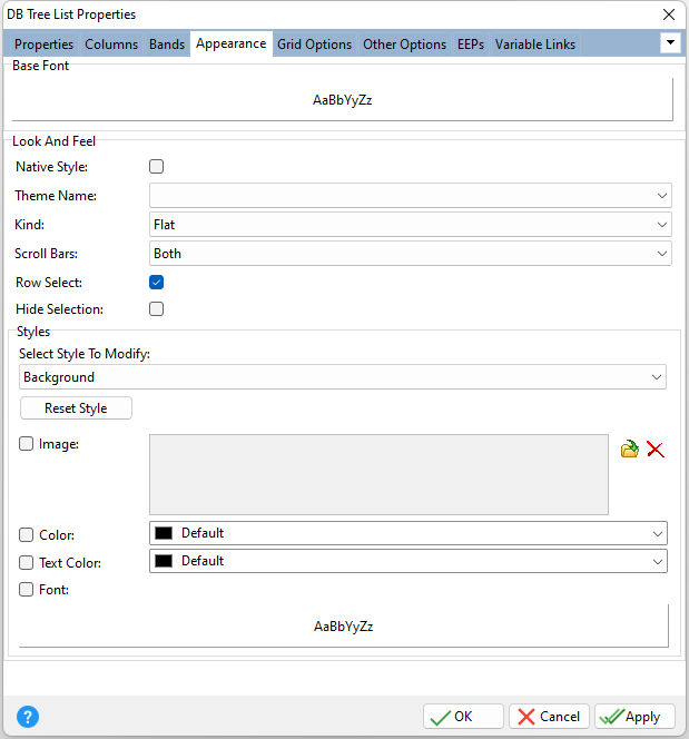
ð Base Font Specifies the font style, size and color for the control
ð Look and Feel Native Style Specifies whether the control will look like a native Windows control. Note: The Native Style has higher priority than the Kind property. Thus, if the Native Style is set, the Kind property has no effect. Theme Name Specifies a theme to display an artistic representation over the control objects, which enhance the visual display. Note: The Theme Name has higher priority than the Kind property. Kind Specifies the look of the control and how the control visually responds on user actions (focus, mouse move, clicks etc.). Basically Kind determines how the control is painted. Scroll Bars Specifies whether to display no scroll bars, the horizontal scroll bar, the vertical scroll bar, or both Row Select Specifies whether the entire row is selected when focused Hide Selection Specifies whether the selected row(s) are painted like other rows when focus leaves the grid control
ð Styles - customizes the appearance of grid control elements, where each element has its own style properties, including: Background, Band Background, Band Content, Band Header, Column Footer, Column Header, Content, Content Even, Content Odd, Footer, Hot Track, Inactive, Indicator, Navigator, Navigator Info Panel, Preview, and Selection
Select Style To Modify Specifies the element to modify Reset Style Reset the element's style to the default Image Specifies an image to display for the element, which can be loaded, deleted, and previewed Color Specifies the background color for the element Text Color Specifies the text color for the element Font Specifies the font style, size, and color for the element
|
|
