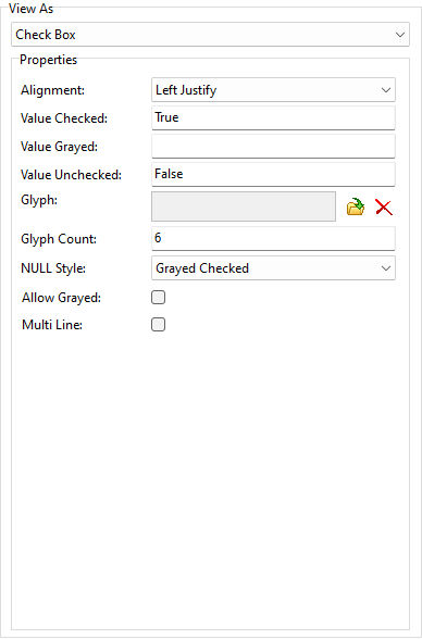
ð Properties Alignment Specifies the justification of the text Value Checked Specifies the text representing the checked state Value Grayed Specifies the text representing the grayed state Value Unchecked Specifies the text representing the unchecked state Glyph Specifies a glyph image to display for the check box, which can be loaded, deleted, and previewed Glyph Count Specifies the number of images within the bitmap referenced by the glyph property Allow Grayed Enables the check box to be in one of three states (enabled, disabled, and grayed) Multi Line Specifies whether the check box caption is drawn across several lines
|
|
