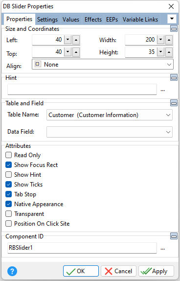
ð Size and Coordinates Left Specifies the left (horizontal) ordinate pixel of the object Top Specifies the top (vertical) ordinate pixel of the object Width Specifies the object width, in pixels Height Specifies the object height, in pixels Align Specifies the alignment of the object. The options are: None - Object can be moved anywhere because it is not aligned to the parent object Client - Aligns itself to the available client area by expanding to fill the parent object that it is in Left - Aligns itself to the left side of the parent object growing or shrinking to match parent height Right - Aligns itself to the right side of the parent object growing or shrinking to match parent height Top - Aligns itself to the top side of the parent object growing or shrinking to match parent width Bottom - Aligns itself to the bottom side of the parent object growing or shrinking to match parent width
ð Hint Value which will display when the object is hovered over by the mouse cursor
ð Table and Field Table Name Specifies the table that the control is associated with Data Field Specifies the column that the control will receive its data from
ð Attributes Read Only Restricts the user from making any changes to the current value. The field is still part of the tab order Show Focus Rect Displays the focus rectangle that appears on form objects in the tab order Show Hint Displays the defined hint Show Ticks Displays the tick line markers Tab Stop Determines whether or not field is part of tab order and user is able to land on this field Native Appearance Specifies to display the control where the appearance will be rendered by the operating system Transparent Allows the background to become transparent to the parent object Position On Click Site Specifies to position the indicator to the value clicked
ð Component ID Unique identifier used when passing property parameters in statements |
|
