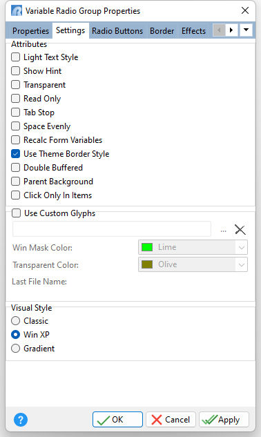
ð Attributes Light Text Style Uses only the shadow to give the caption a three dimensional appearance Show Hint Displays the defined hint Transparent Allows the background to become transparent to the parent object Read Only Restricts the user from making any changes to the current value. The field is still part of the tab order. Tab Stop Determines whether or not field is part of tab order and user is able to land on this field Space Evenly Adds even spacing between radio group items Recalc Form Variables Recalculates form variables, defined within the Expression Builder, when focus is shifted away from the object Use Theme Border Style Uses the border style of the Theme, if specified. Otherwise, the defined border color and width will be displayed. Double Buffered Specifies to reduce painting operations (flickering) for the control background by storing an internal bitmap image Parent Background Forces the control to follow the color attributes of its parent control, working like a transparency, in taking the parent object as the background Click Only In Item Specifies a mouse click only registers when the action occurs upon a radio button item. The default is false.
ð Use Custom Glyphs Loads a custom glyph image file to display on the button object. The custom glyph must contain all 6 different radio button states like the image displayed below:
The radio button states must progress in the order below:
Win Mask Color Specifies the color for the custom glyph background mask color. For the above example glyph, the window mask color is fuchsia. Transparent Color Specifies color for custom glyph background color when the transparent attribute is enabled.
ð Visual Style Specifies the visual style for the control |
|

