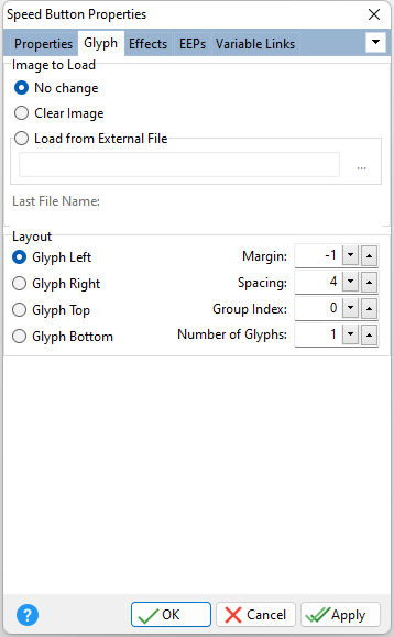
ð Image to Load No Change - Leaves the current setting intact Clear Image - clears the loaded image Load from External File - loads an image file to display on the button object
NOTE: The lower left pixel of a bitmap loaded into the button is reserved for the "transparent color". As a consequence, any pixel which matches that lower left pixel will be transparent.
ð Layout Specifies the location of the glyph Margin Determines the glyph's pixel distance from the edge of the control Spacing Determines the spacing from the glyph to the caption text Group Index Specifies the index of the item in the group that was most recently clicked. This option is property is useful when you need to determine the item in the group that invoked a shared event handler when using the PROPERTY/GETPROPERTY commands. Number of Glyphs Specifies the number of glyphs in the loaded bitmap image. Valid values are 0 through 4. All glyphs must be the same size and next to each other in a row like the 4-glyph bitmap example below.
The first glyph is used for the normal Up state. The second one is used when the button is Disabled, and the third is used for the Down state. The last glyph is used when the button can be kept in the Down state. |
|

