Tip! - A Speed Button control can be converted to an Enhanced Speed Button control. Within the Form Designer, right click on the Speed Button and select the "Convert to Enhanced Speed Button" option.
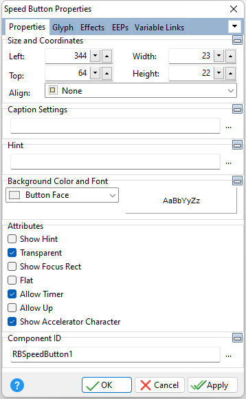
ð Size and Coordinates Left Specifies the left (horizontal) ordinate pixel of the object Top Specifies the top (vertical) ordinate pixel of the object Width Specifies the object width, in pixels Height Specifies the object height, in pixels Align Specifies the alignment of the object. The options are: None - Object can be moved anywhere because it is not aligned to the parent object Client - Aligns itself to the available client area by expanding to fill the parent object that it is in Left - Aligns itself to the left side of the parent object growing or shrinking to match parent height Right - Aligns itself to the right side of the parent object growing or shrinking to match parent height Top - Aligns itself to the top side of the parent object growing or shrinking to match parent width Bottom - Aligns itself to the bottom side of the parent object growing or shrinking to match parent width
ð Caption Settings Caption Value which the object will display when the form is run Caption Alignment Specifies the horizontal justification of the text within the object. The options are: žLeft - Text is left justified Center - Text is center justified Right - Text is right justified
ð Hint Value which will display when the object is hovered over by the mouse cursor
ð Background Color and Font Specifies the background color of the object AaBbYyZz Specifies the font style, size and color for the object
ð Attributes Show Hint Displays the defined hint Transparent Allows the background to become transparent to the parent object Show Focus Rect Displays the focus rectangle that appears on form objects in the tab order Flat Allows the button to appear flat without a frame unless the cursor moves over the button Allow Timer Enables the timer options under Effects in order to execute code in time intervals Allow Up Displays the button in the up position. With multiple glyph in a group, this allows the button to behave in a Radio Group button behavior. Show Accelerator Character If unchecked, the text will show the ampersand (&) symbol as opposed to underscoring the next character for a keyboard shortcut
ð Component ID Unique identifier used when passing property parameters in statements |
|