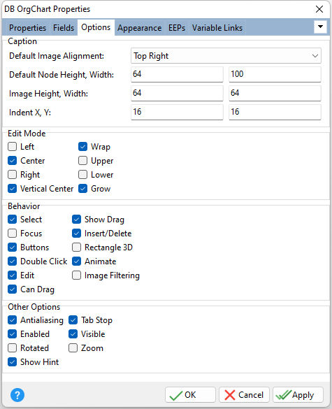
ð Caption Default Image Alignment Specifies the default value for the image alignment Default Node Height, Width Specifies the default height and width for tree nodes Image Height, Width Specifies the height and width for images Indent X, Y Specifies the width of the blank space separating nodes horizontally, and vertically. Use the indent values to determine by what amount child nodes are separated from their parents.
ð Edit Mode Left Text is left-justified in the client area of a node. Center Text is centered within a node. Right Text is right-justified in the client area of a node. Vertical Center Text is vertically centered within a node. This mode works successfully with single lines only. Wrap Text automatically wraps. When necessary, if this property is set to False, the width of a node increases to the text size. Upper During editing, letters are converted into upper case. Lower During editing, letters are converted into lower case. Grow If necessary, the height of nodes grow to the size of appropriate text.
ð Behavior Select Specifies if the focused node's background is filled with the highlight color Focus Specifies if the currently focused item is emphasized with a focus rectangle Buttons Specifies if nodes with children display expand/collapse buttons ([+] and [-]). In Zoom mode, only [+] buttons are displayed. Double Click Specifies if a mouse double click opens and closes the selected node Edit Specifies if text editing in nodes is allowed Can Drag Specifies if a node can be dragged to another node Show Drag Specifies to display the location of a node and its connection with the potential parent during node drag operations Insert/Delete Specifies if nodes can be inserted or deleted using the [Insert], [Ctrl+Insert], and [Delete] keys Rectangle 3D Specifies if rectangle nodes (Shape = Rectangle) are displayed with the three-dimensional effect Animate Specifies if nodes are expanded/collapsed with animation Image Filtering Specifies if filtering is applied to images shown within zoomed chart elements. Set this flag to improve the quality of these images.
ð Other Options Antialiasing Specifies whether chart elements use smoothing when painted Enabled Specifies the control's accessibility to end users Rotated Rotates the tree structure layout. Use this property to flip the component's display 90 degrees. If the property is set to True, nodes of the same level are positioned vertically and parents are on the left in relation to child nodes. Set Rotated to False to return the component to its normal state with a horizontal layout of child nodes. Show Hint Displays the defined hint Tab Stop Determines whether or not the control is part of tab order and user is able to land on this field Visible Specifies if the control is visible Zoom Specifies the component's zooming mode. Use Zoom to display the entire tree structure within the component window at runtime. When checked, the component diminishes to the window size (when necessary) and never displays scroll bars. In this mode, a user cannot edit a node's text.
|
|