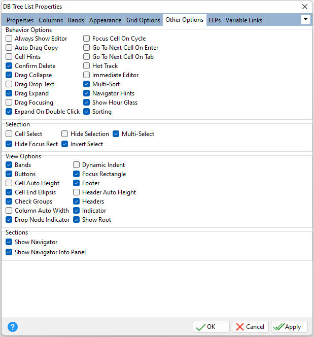
ð Behavior Options Always Show Editor Determines whether the focused cell's editor is always active Auto Drag Copy Specifies whether nodes are copied during drag-and-drop operations Cell Hints Specifies whether a hint is displayed for a cell when the text does not fit into the cell's area Confirm Delete Specifies whether the confirmation dialog is displayed when an end-user deletes a node by pressing the [Ctrl+Del] key combination Drag Collapse Specifies whether an expanded node located under the mouse pointer is automatically collapsed during drag-and-drop operations Drag Drop Text Specifies whether an image of the currently dragged object is being layered over the control Drag Expand Specifies whether a collapsed node located under the mouse pointer is automatically expanded during drag-and-drop operations Drag Focusing Specifies whether a node located under the mouse pointer is automatically focused during drag-and-drop operations Expand On Double Click Specifies whether double-clicking a node changes its expansion state Focus Cell On Cycle Determines the manner in which edit cells are focused Go To Next Cell On Enter Determines whether control items can be navigated by using the [Enter] key Go To Next Cell On Tab Determines whether the [Tab] key is used to navigate through the current editing control cells Hot Track Specifies whether nodes are hot-tracked when the mouse pointer is located over them Immediate Editor Determines whether the appropriate editor is activated immediately after an edit cell is clicked Multi-Sort Specifies whether nodes can be sorted by multiple columns Navigator Hints Specifies if hints should be displayed for buttons displayed in an editing control's navigator Show Hourglass Specifies whether the hourglass cursor is displayed when performing long operations Sorting Specifies whether end-users can sort nodes by clicking column headers
ð Selection Cell Select Specifies whether individual cells can be selected instead of entire nodes Hide Focus Rect Specifies whether the focus rectangle is displayed around the focused cell when the Tree List control loses focus Hide Selection Specifies whether the selected cell remains highlighted when the Tree List control loses focus Invert Select Specifies whether a single cell within the focused node or the whole node is highlighted when focused Multi-Select Specifies whether multiple cells can be selected by end-users
ð View Options Bands Specifies the visibility of band headers within the Tree List control Buttons Specifies the visibility of expand buttons within Tree List parent nodes Cell Auto Height Specifies whether the cell height varies according to the cell's text length Cell End Ellipsis Specifies to display an ellipsis when the entire text cannot be displayed within a cell Check Groups Specifies whether check boxes or radio buttons can be used in nodes Column Auto Width Determines whether column widths are automatically adjusted to display all data cells without using the horizontal scroll bar Drop Node Indicator Specifies the visibility of indicators that assist end-users during drag-and-drop operations Dynamic Indent Specifies whether node image widths affect indents for expand buttons and tree lines Focus Rectangle Displays the focus rectangle Footer Specifies whether the grid footer is displayed Header Auto Height Specifies whether the height of band rows is automatically adjusted to completely display column header captions within the Tree List control Headers Specifies whether the header is displayed Indicator Specifies whether a small pointer appears in the first column, to indicate which row is current Show Root Specifies the visibility of expand buttons and tree lines linking root level nodes
ð Sections Show Navigator Specifies whether to display a controller to navigate through visible rows in the order that they are displayed on screen Show Navigator Info Panel Specifies whether to display the record number and total record count for the current dataset
|
|
