Toolbar Drop-Down Menus are created using two separate component tabs; the Toolbar Drop-Down Menu, and the Toolbar. Before you can create and design the Toolbar, you first need to create your toolbar drop-down menus.
If you click on the Toolbar Drop-Down Menus tab, you will see the design area below.
ð Add
Adds a Drop-Down Menu. You will find that the menu name is automatically assigned, in numerical succession, and is not editable. This is simply because the Toolbar Drop-Down Menu's name is used only for the system to associate it when you assign it to a Toolbar Drop-Down Menu Button during the last stages of the design process.
ð Delete
Deletes the currently focused Drop-Down Menu item.
ð Add Items to Root Level
Adds a root level item to a Drop-Down Menu
ð Add Items to Selected
Adds submenus to the root level of the Drop-Down Menu. There is no limitation as to how many levels you can create. You can also add submenus to existing submenus, which display to the right or left with an arrow character at the end.
ð Delete Selected Item button
Deletes the currently focused item. You can delete submenu items one at a time, or you can delete an entire menu tree by selecting the root menu.
ð Edit Selected Item
Displays options to edit the properties of an existing menu item. First place the focus on the menu item in order to edit the properties.
To understand the logic, you have to consider the Toolbar Drop-Down Menu as an actual component that is used in conjunction with the Toolbar. This is simply a group of Actions, selected from your list of available Actions that were created in the earlier stages of the application's design, assembled into a single module that is displayed in a menu tree format when the object on the Toolbar is depressed.
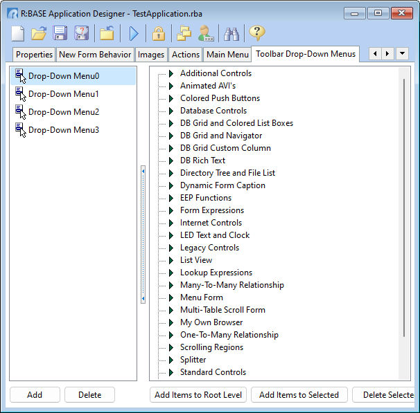
Before you create a new Drop-Down Menu, click on one of the existing sample modules to see how it all works. To demonstrate this, click on the Drop-Down Menu0 item in the left section of the designer, and you will see a screen like the above.
On the right hand side, you will see a list of the menu items displayed in the typical "tree" format.
This design is EXACTLY like the design in the Main Menu section. You can build menu trees of any number of levels deep. This example demonstrates a single level list of items, but you could expand this, infinitely. If you place the focus on a selected item, and click the Edit Selected Item button, you will see the familiar Menu Item Editor dialog.
The same rules apply here about the Menu Item Caption and Image Index when assigning an Action. If you assign an Action to the Menu Item, the Caption and Image Index set in the Action's properties will override the settings that you make here. Also, if you create menu trees, remember the rule about not assigning an Action to the root level menu, otherwise, you will not be able to access the submenus.