When you are adding or editing Toolbar Drop-Down Menu Items, you will be presented with a Menu Item Editor to set the properties for the new root level menu item. This program interface is identical to editing Main Menu Items.
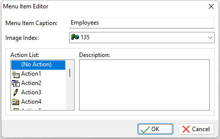
ð Menu Item Caption
Specifies the caption field for the menu bar. You can add an ampersand (&) in front of a letter in the caption field to create a "[Alt]" hot key for a Drop-Down Menu item. This places an underline beneath the appropriate letter when the application is run and the [Alt] key is pressed.
ð Image Index
Specifies an image to be assigned to a Drop-Down Menu item. Available images include the image files loaded from the Image tab.
ð Action List
Displays the list of defined Actions.
ð Description
Displays a description for the selected action in the Action List. This basically helps you add the correct action to the appropriate Drop-Down Menu Item.
Assigning Actions
When you are assigning actions to your Drop-Down Menu Items (root level and submenu items), there are three different behaviors that can be assigned:
| 1. | No Action - The "(No Action)" value is generally used for a root level menu item. By doing so, when you run the application and select the Toolbar button, the submenu "drops down" with your list of actions assigned to it. Otherwise, you could assign an action to a Toolbar button if it does not have any submenus assigned to it. |
The "(No Action)" value can also be assigned to a submenu item when there is the need for an additional submenu to appear "off of" the Drop-Down Menu itself. This is generally used for drop down menu items that have additional options.
| 2. | An Action From the "Action List" - Actions can be assigned to the Root Level and to existing submenus. Select one of the available actions in the Action List to assign it. |
| 3. | Separator - an aesthetic line that creates a break between the buttons. An important note about using the Separator is that it MUST be used BETWEEN button objects. If your Toolbar definition ends with a separator, the entire Toolbar will be disorganized aesthetically. Also, when using a Separator, the other properties like Action List and Drop-Down Menu settings are all ignored for this object. |
NOTE:
•After Actions are assigned to a Root Level or another submenu, the actions can be rearranged by dragging the item with your mouse cursor.
•If you have selected a submenu item, the "Menu Item Caption" and "Image Index" fields are disabled. These properties for submenu items can only be changed in the Actions area.