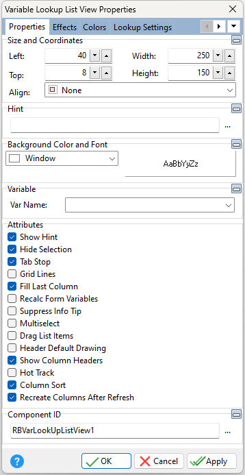
ð Size and Coordinates Left Specifies the left (horizontal) ordinate pixel of the object Top Specifies the top (vertical) ordinate pixel of the object Width Specifies the object width, in pixels Height Specifies the object height, in pixels Align Specifies the alignment of the object. The options are: None - Object can be moved anywhere because it is not aligned to the parent object Client - Aligns itself to the available client area by expanding to fill the parent object that it is in Left - Aligns itself to the left side of the parent object growing or shrinking to match parent height Right - Aligns itself to the right side of the parent object growing or shrinking to match parent height Top - Aligns itself to the top side of the parent object growing or shrinking to match parent width Bottom - Aligns itself to the bottom side of the parent object growing or shrinking to match parent width
ð Hint Value which will display when the object is hovered over by the mouse cursor
ð Background Color and Font Color Specifies the background color of the object AaBbYyZz Specifies the font style, size and color for the object
ð Variable Choose the variable whose value will appear in the object from the list of currently defined variables
ð Attributes Show Hint Displays the defined hint Hide Selection Use Hide Selection to specify whether the user is given visual feedback about the current selection in the list view when it does not have focus. If checked, the current selection is not visually distinct from other items until focus returns to the control. If unchecked, the current row always appears selected. Tab Stop Determines whether or not field is part of tab order and user is able to land on this field Grid Lines Displays vertical and horizontal separator lines Fill Last Column Automatically resizes the last column so that it fills any extra space left in the control area. This property has no effect if the total width of all columns, excluding the last column, exceeds the width of the control. When checked, and if all columns are visible in the control area, the horizontal scroll bar will not be displayed. Recalc Form Variables Recalculates form variables, defined within the Expression Builder, when focus is shifted away from the object Suppress Info Tip Suppresses the hint when an item text value exceeds the control width Multiselect Allows the ability to select multiple items from the list Drag List Items Allows the user to drag and reorder list items Header Default Drawing Specifies if the operating system controls drawing the Header Size, or if the control will read the "Header Height" setting Show Column Headers Specifies if the column header is displayed Hot Track Specifies if the header changes color when the mouse is hovered over it Column Sort Specifies if the header columns allow sorting by clicking on the header Recreate Columns After Refresh Specifies if the columns are preserved after the control is refreshed. When checked, the columns are cleared then recreated every time the list view contents are refreshed. When unchecked, the columns will be populated only after the first load.
ð Component ID Unique identifier used when passing property parameters in statements |
|