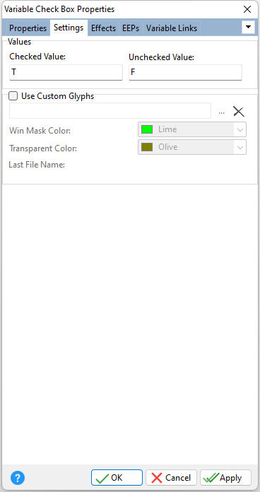
ð Values Checked Value Specifies the value of the data field if checked Unchecked Value Specifies the value of the data field if unchecked
ð Use Custom Glyphs Loads a custom glyph image file to display on the control. The custom glyph must contain all 9 different check box states like the image displayed below:
The check box states must progress in the following order:
Win Mask Color Specifies the color for the custom glyph background mask color. For the above example glyph, the window mask color is teal. Transparent Color Specifies color for custom glyph background color when the transparent attribute is enabled. |
|
