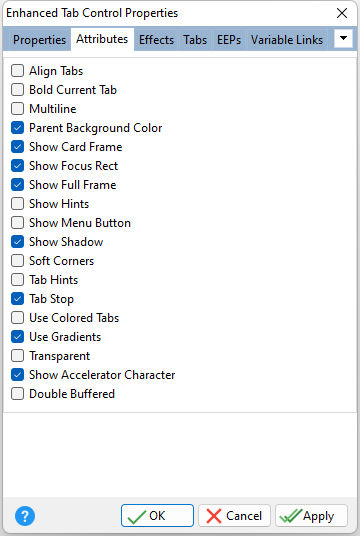
Align Tabs Aligns the widths of the tabs to meet the Tab Control width Bold Current Tab Displays a bold text caption for the selected tab Multiline Wraps page tabs if they exceed the width of the object Parent Background Color Forces the control to follow the color attributes of its parent control Show Card Frame Displays the rectangle frame beneath the tabs Show Focus Rect Displays focus rectangle when a tab is selected Show Full Frame Displays the entire object frame Show Hints Displays the defined hints Show Menu Button Displays the "down arrow" menu button to jump to a tab Show Shadow Displays a shadow behind the control Soft Corners Rounds off the tab corner edge which points to the base Tab Hints Displays hints for the tabs Tab Stop Determines whether or not field is part of tab order and user is able to land on this field Use Colored Tabs Displays a darker shade to unselected tabs Use Gradients Allows to gradient to appear on the object Transparent Allows the background to become transparent to the parent object Show Accelerator Character If unchecked, the text will show the ampersand (&) symbol as opposed to underscoring the next character for a keyboard shortcut Double Buffered Specifies to reduce painting operations (flickering) for the control background by storing an internal bitmap image |
|
