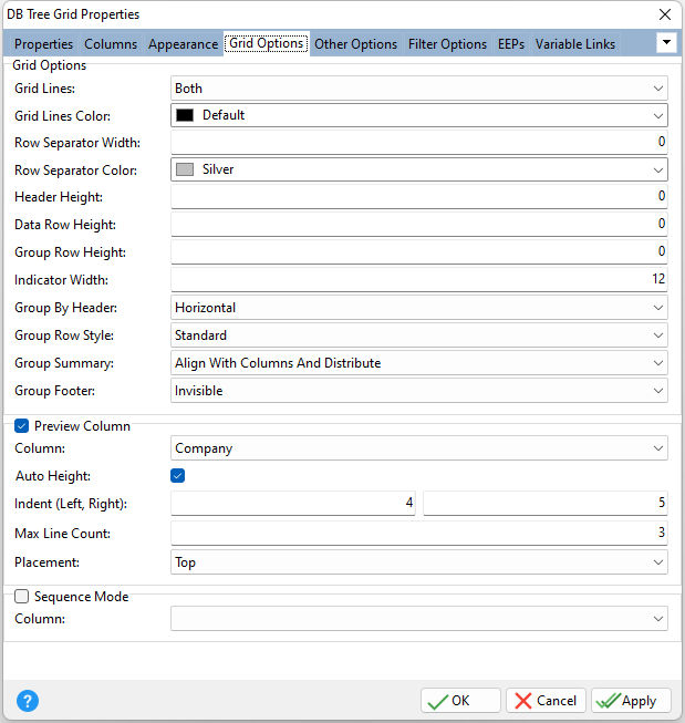
ð Grid Options Grid Lines Specifies whether grid lines appear vertically, horizontally, in both directions, or not at all Grid Lines Color Specifies the grid line color Row Separator Width Specifies the separator width between to rows Row Separator Color Specifies the row separator color Header Height Specifies the column header height Data Row Height Specifies the data row height Group Row Height Specifies the height of grouping rows in pixels. If set to 0, the height of grouping rows is calculated automatically based on the current font settings. Indicator Width Specifies the row indicator's width Group By Header Specifies how multiple column groupings are displayed within the header Group Row Style Specifies the grid row style Group Summary Specifies the placement style of the group summaries within the table view of the grid Group Footer Specifies the group footer to be never visible, visible only for expanded group rows, or always visible
ð Preview Column - displays a single column preview, with this column's values. Column Specifies the column to preview Auto Height Specifies whether the preview section height varies according to the preview's text length Indent (Left, Right) Specifies the distance between the preview text and the left preview section border, and the distance between the preview text and the right preview section border Max Line Count Specifies the maximum number of text lines displayed within the preview section Placement Specifies the preview section position relative to the row for which it is displayed
ð Sequence Mode Column Specifies to assign a column which controls the sequence order of rows in the grid. When Sequence Mode is checked the column headers are no longer click-able, meaning users cannot sort the columns. The "sequence" column should be an integer, and is expected to have a value. Sequence Mode requires Drag and Drop is enable for the grid |
|
