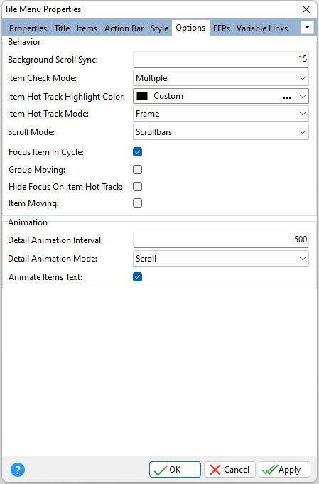
ð Behavior Background Scroll Sync Specifies how quickly the tile menu's background can be scrolled when you scroll the tile menu's content. Use this property to connect background and content scrolling using a percentage value of the content scroll speed. This value ranges from 0 (when the tile menu background is static and cannot be scrolled) to 100 (when the background's scroll speed matches the scroll speed of tile menu contents). Note that the background is scrolled only if the Stretch property value is set to No Resize or Tile. Item Check Mode Controls if end-users can right-click or swipe down tile items to toggle their checked state; None, Single, or Multiple •None - Tile items cannot be checked. This option unchecks all the currently checked tile items, clearing the checked items list. •Single - One or zero items can be checked. This option unchecks the currently checked tile item, when another tile item is checked. •Multiple - Right-clicking or swiping down a tile item toggles its checked state (also called selected state). You can access all the tile items that are currently checked within a tile menu via its checked items list. Item Hot Track Highlight Color Specifies the color used to highlight a hot-tracked tile item Item Hot Track Mode Controls if end-users can hot-track tile items within a tile menu using the mouse. Hot-tracking a tile item removes the focus indication from the currently focused item if the "Hide Focus On Item Hot Track" property is checked. •Frame - A hot-tracked tile item is emphasized with a frame painted around it (default). •Highlight - A hot-tracked tile item is highlighted using the color specified via the "Item Hot Track Highlight Color" property. •None - Item hot-tracking is disabled. Scroll Mode Controls how end-users can scroll tile menu contents that are not shown in their entirety; Default, Scrollbars, Scroll Buttons. •Default - The contents can be scrolled using drag operations (by starting the operation on an area free from any tile items and/or groups), taps, and arrow buttons (by navigating tile items). •Scrollbars - In addition to the default options, the contents can be scrolled using the mouse wheel and the horizontal and/or vertical scrollbar (default). •Scroll Buttons - In addition to the default options, the contents can be scrolled by clicking the scroll buttons located within scroll button areas. These areas are four hot zones aligned to the tile menu's edges. Hovering the mouse pointer over any of these areas displays the corresponding scroll button. Focus Item On Cycle Determines whether focus moves to the next/previous row after it passes the rightmost/leftmost tile within the current row Group Moving Controls if end-users can re-arrange entire tile groups within a tile menu using drag and drop Hide Focus On Item Hot Track Specifies if hot-tracking a tile item removes the focus indication from the currently focused item Item Moving Controls if end-users can re-arrange tile items within a tile menu using drag and drop
ð Animation Detail Animation Interval Specifies the animation delay (in milliseconds) for detail page navigation. Use this property to specify the delay between switching the active detail page with the navigation from/to the main page or between detail pages. Detail Animation Mode Specifies the animation transition effect for detail page navigation; Scroll, Fade, Segmented Fade, Random Segmented Fade Animate Items Text Specifies if text blocks in a tile are animated along with its background and glyph when showing this tile
|
|