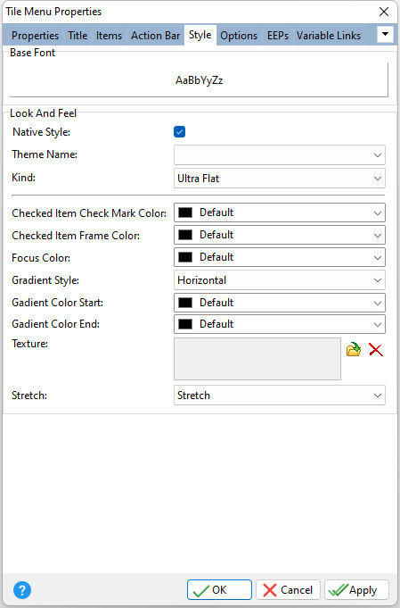
ð Base Font Specifies the font style, size and color for the tile menu
ð Look and Feel Native Style Specifies whether the tile menu will look like a native Windows control. Note: The Native Style has higher priority than the Kind property. Thus, if the Native Style is set, the Kind property has no effect. Theme Name Specifies a theme to display an artistic representation over the control objects, which enhance the visual display. Note: The Theme Name has higher priority than the Kind property. Kind Specifies the look of the control and how the control visually responds on user actions (focus, mouse move, clicks etc.). Basically Kind determines how the control is painted.
Checked Item Check Mark Color Specifies the color of check marks displayed in checked tiles Checked Item Frame Color Specifies the color of the frame displayed around checked tiles Focus Color Specifies the color of the focus rectangle Gradient Style Specifies the gradient fill type for a tile menu element's background; Horizontal, Vertical, Forward Diagonal, Backward Diagonal Gradient Color Start Specifies the start color of a gradient fill or the fill color for a solid filling used for a tile menu element's background Gradient Color End Specifies the end color of a gradient fill used for a tile menu element's background Texture Specifies a texture glyph to display for the title, which can be loaded, deleted, and previewed Stretch Specifies how an image specified by the Texture property fills a tile menu element's background; Stretch, Tile, No Resize
|
|
