The Toolbar tab is the "toolbar" building area for your Toolbar Drop-Down Menus. You will see several different property areas.
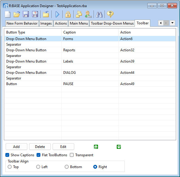
Begin with looking at the grid in the upper portion of the designer. This is where the physical layout of the Toolbar is mapped, and where you alter the properties of the Toolbar components. Building a Toolbar is very straight forward. You simply arrange the components from top to bottom the way in which you want them to appear on the Toolbar. Using the Add, Delete, Edit and reorder buttons, you have infinite possibilities for its design.
ð Add
Adds a drop-down menu button, a button, or separator to the Toolbar
ð Delete
Deletes a selected item from the Toolbar
ð Edit
Edit a selected Toolbar item
ð Show Captions
Displays the button caption text
ð Flat Tool Buttons
Displays the Toolbar buttons without the borders around the buttons. It gives a smooth look that only shows the borders when the mouse cursor is hovered over the button.
Transparent
Displays transparent Toolbar buttons
Toolbar Align
Specifies the alignment of the Toolbar on the application window
NOTE:
•To rearrange the order of the Toolbar components, select the component that you want to reorder, and use the up/down arrows to move it to the desired location.