When you are adding and editing Toolbar buttons, you will be presented with the Toolbar Button Editor.
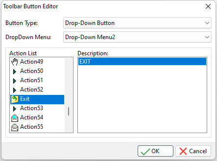
ð Button Type
Specifies the Toolbar button type. There are three available button types:
•Tool Button - a button that has a single action. Any setting in the "Drop-Down Menu" field will be ignored.
•Drop-Down Button - a button that is used in conjunction with a previously created Drop-Down Menu. It is a dual purpose button that has two functions; the action selected from the Action List will be executed if the button portion of the object is clicked, and the Drop-Down Menu that is selected in the Drop-Down Menu field will be displayed when the down-arrow portion of the button is depressed.
•Separator - an aesthetic line that creates a break between the buttons. An important note about using the Separator is that it MUST be used BETWEEN button objects. If your Toolbar definition ends with a separator, the entire Toolbar will be disorganized aesthetically. Also, when using a Separator, the other properties like Action List and Drop-Down Menu settings are all ignored for this object.
ð Drop-Down Menu
Specifies the existing Drop-Down Menu that will be associated to the Drop-Down Button
ð Action List
Displays the list of defined Actions.
ð Description
Displays a description for the selected action in the Action List. This basically helps you add the correct action to the appropriate Button.
NOTE:
•When using Drop-Down Menu objects, if you want an image to appear on the button portion of the object, but not execute anything if it is clicked, you need to assign an Action from the Action list that has no actual action assigned to it, only an image.