Tip! - A DB Grid control can be converted to an Enhanced DB Grid control. Within the Form Designer, right click on the DB Grid and select the "Convert to Enhanced DB Grid" option.
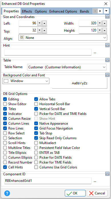
ð Size and Coordinates Left Specifies the left (horizontal) ordinate pixel of the object Top Specifies the top (vertical) ordinate pixel of the object Width Specifies the object width, in pixels Height Specifies the object height, in pixels Align Specifies the alignment of the object. The options are: None - Object can be moved anywhere because it is not aligned to the parent object Client - Aligns itself to the available client area by expanding to fill the parent object that it is in Left - Aligns itself to the left side of the parent object growing or shrinking to match parent height Right - Aligns itself to the right side of the parent object growing or shrinking to match parent height Top - Aligns itself to the top side of the parent object growing or shrinking to match parent width Bottom - Aligns itself to the bottom side of the parent object growing or shrinking to match parent width
ð Hint Value which will display when the object is hovered over by the mouse cursor
ð Table Name Specifies the table to base the control on
ð Background Color and Font Color Specifies the background color of the object AaBbYyZz Specifies the font style, size and color for the object
ð DB Grid Options Editing Specifies if editing is allowed Show Editor Specifies the grid is always in edit mode. When checked, the user does not have to press the [Enter] key before editing the contents of a cell. The setting depends on "Editing" also being checked. Show Editor is ignored if "Row Select" is checked. Titles Specifies if titles appear at the top of the columns in the grid Indicator Specifies if a small pointer appears in the first column to indicate which row is currently selected Column Resize Specifies the column may be resized when the titles are visible Column Lines Specifies if lines appear between columns in the grid Row Lines Specifies if lines appear between the rows of the grid Row Select Specifies if the user can select an entire row, as well as selecting individual cells. If this options is selected, then "Editing" and "Always Show Editor" options are ignored. Selection Specifies if the selected cell displays the focus rectangle even when the grid does not have focus Scroll Hints Specifies if the vertical scroll bar displays the current record number from where the focus is located Multiline Titles Specifies if multiline column titles are displayed Title Ellipsis Suppresses the extra words of a long title value with "..." Column Ellipsis Suppresses the extra words or sentences of a long column value with "..." Record Number Specifies if the record number is displayed within a column grid on the left side of the grid Cell Hints Specifies if hints will be displayed above the cells Allow Tabs When checked, the [TAB] key will move the focus to the next cell within the grid. When unchecked, the [TAB] key moves the focus to the next field in the form's Tab Order. Horizontal Scroll Bar Specifies if the horizontal scroll bar is displayed Vertical Scroll Bar Specifies if the vertical scroll bar is displayed Picker for DATE and TIME Fields Specifies if a picker is displayed for DATE (pop up) and TIME (spin edit) data type fields Show Hint Specifies if the defined hint is displayed Native Appearance Specifies to display the control where the appearance will be rendered by the operating system Grid Focus Navigation Specifies whether the cursor navigation on fields require the [Enter] key to manipulate a cell contents and move up and down. When enabled, the [Enter] key is required in order to exit a field and move from row to row after editing. Tab Stop Specifies if the control is part of tab order and user is able to land on this field Skip Read Only Columns Determines whether read only columns are skipped when pressing [Enter] or [Tab] through the fields. Using the arrow keys will move the cell highlight to the next/previous cell regardless of the "Skip Read Only Columns" value. Multiselect Allows the ability to select multiple items from the grid Persistent Field Value Color Specifies whether the color for specific cells will not be filled with the Highlight color, when a row is selected. The setting is only recognized when "Row Select" is also checked. ENTER as TAB When enabled, the [Enter] key will process the user's input on that field and move to the next field or row. To move to the previous cell, use the [Shift+ENTER] key combination. Picker for DATE Fields Specifies if a picker is displayed for DATE (pop up) data type fields. When "Picker for DATE and TIME Fields" is unchecked, this property is enabled. Picker for TIME Fields Specifies if a picker is displayed for TIME (spin edit) data type fields. When "Picker for DATE and TIME Fields" is unchecked, this property is enabled. Columns Use Grid Colors Specifies whether the grid uses its font and background color, and not the color definition of the columns
ð Component ID Unique identifier used when passing property parameters in statements |
|