An Action Bar extends the Tile Menu control with an additional context-specific functionality, similar to context menus in toolbar/menu systems. The functionality is provided via click-able items (also called action buttons) that reside within tile action bars in one row. End-users can click or tap these buttons in order to activate their functionality.
Linking Tiles and Action Bar Items
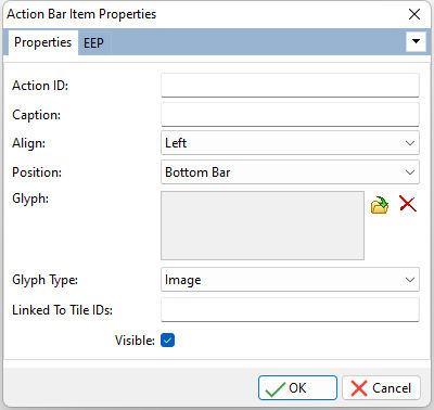
The "Linked To Tile IDs" setting is the key field to link an Action Bar Item to one or more tiles, based upon Tile IDs. If no value is specified, the Action Bar Item will appears for all tiles. To specify several tiles, enter the Tile ID list values as a comma separated string. This method requires no coding. For example, an Action Bar Item may be expected to appear for only tiles relating to a customer data tile group. In the properties for the Action Bar Item, the "Linked To Tile IDs" field would include a list (comma separated) of all Tile IDs for the customer tiles.
To perform ID and Action Bar Item linking manually through code, the PROPERTY command is used within the On Tile Check EEP to gather the list of checked tiles, then specify which Action Bar Item are to be displayed/hidden. To specify that all Action Bar Items be displayed, use the asterisk (*).
Example:
-- Captures the list of checked tiles
PROPERTY TileMenu1 CHECKEDTILES 'vTileIDs'
IF vTileIDs IN ('Customer,Contact,Employee') THEN
PROPERTY TileMenu1 SHOWACTIONBARITEM 'Add,Edit,Print'
PROPERTY TileMenu1 HIDEACTIONBARITEM 'Maintenance,Tools'
ENDIF
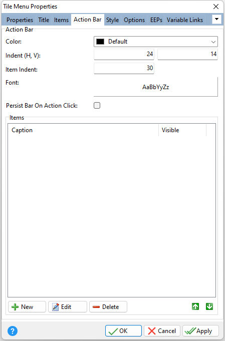
ð Title Color Specifies the background color of action bars Indent (H, V) Specifies the space (in pixels) between the left and right edges of an action bar and its visible items, and the space between the top and bottom edges of an action bar and its visible items Item Indent Specifies the space between visible action bar items, in pixels Font Specifies the font style, size, and color for action bar items Persist Bar On Action Click Specifies the action bar to remain displayed after an action bar item is clicked
ð Items New Adds a new action bar item Edit Edits the currently selected action bar item Delete Deletes the currently selected action bar item Duplicate Duplicates the currently selected action bar item Edit Custom EEP Opens the R:BASE Editor to create/edit a custom EEP that is stored within action bar item
The Action Bar Item display sequence can be reordered by selecting the green up and down arrow buttons.
|
|