The Dynamic Items represents tiles whose properties derive from a dataset. The tile properties are mapped to defined table and column names. Each row in the table pertains to a single tile. A field in the dataset is assigned as the Group. Only relevant fields (or fields that will change between each tile) need to be mapped. Other visual properties for the tiles (color, style, font, etc.) may be taken from a group or tile template. All Dynamic Tile items share the same On Tile Click EEP.
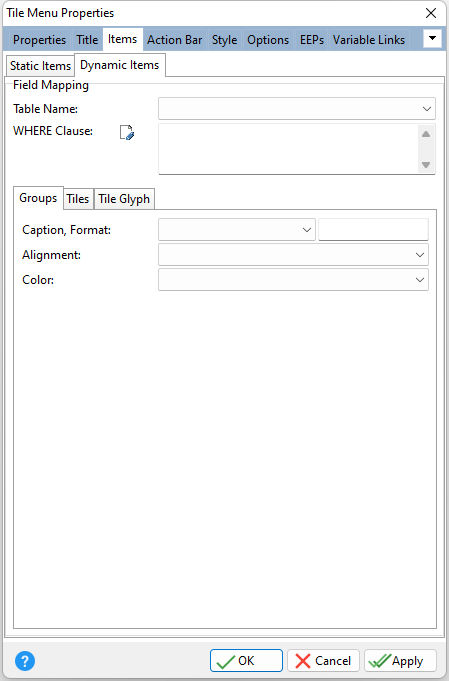
ð Field Mappings Table Name Specifies the table/view to base the tile group and tile properties WHERE Clause Specifies the WHERE Clause for the field mapping
ð Groups Caption Specifies the tile group caption, and maps the tile group Caption property to the corresponding table column. The Format field specifies the display format for the column. Alignment Specifies the horizontal justification of the text within the tile group header, and maps the tile group Alignment property to the corresponding table column Color Specifies the background color for the tile group, and maps the tile group Color property to the corresponding table column
ð Tiles Tile Template Specifies the template which serves as the tile design pattern Tile ID Specifies the tile ID, mapping to the corresponding unique ID column in a table Size Specifies the tile size, and maps the tile Size property to the corresponding table column •Small - a small tile item is about half the size of a regular item •Regular - a regular tile item whose height and width is defined by the Item (Height, Width) properties, and is common to all tile items •Large - specifies an item which is twice as wide as a regular tile item •Extra Large - specifies a large item that occupies two rows Row Count Specifies the number of rows that the tile item occupies, and maps the tile Row Count property to the corresponding table column Border Color Specifies the tile border color, and maps the tile Border Color property to the corresponding table column Gradient Style Specifies the gradient fill type for the tile's background; Horizontal, Vertical, Forward Diagonal, Backward Diagonal, and maps the tile Gradient Style property to the corresponding table column Gradient Color Start Specifies the start color of a gradient fill or the fill color for a solid filling used for the tile's background, and maps the tile Gradient Color Start property to the corresponding table column Gradient Color End Specifies the end color of a gradient fill used for the tile's background, and maps the tile Gradient Color End property to the corresponding table column
Text 1-4 The tile is capable of displaying up to four text blocks on the surface. Use the Text 1 tab to specify text settings of the first text block. By default, this text block is displayed in the tile's top-left corner. Select the Text 2 (top right corner), Text 3 (bottom left corner), and Text 4 (bottom right corner) tabs to assign a text block to the other surface corners of the tile. Caption Specifies the caption for the text block area (Text 1-4), and maps the tile Caption property to the corresponding table column Format Specifies the display format for the column Font Name Specifies the font name for the text block area (Text 1-4), and maps the tile Font Name property to the corresponding table column Font Size Specifies the font size for the text block area (Text 1-4), and maps the tile Font Size property to the corresponding table column Font Color Specifies the font color (integer color or text color name) for the text block area (Text 1-4), and maps the tile Font Color property to the corresponding table column Font Style Specifies the font style for the text block area (Text 1-4), and maps the tile Font Style property to the corresponding table column. The value may contain any combination of B, I, U, and S; representing bold, italic, underline, and strikeout. For example, to specify BOLD and UNDERLINED, set the value as BU.
ð Tile Glyph Position Specifies the position of the glyph image, and maps the glyph Position property to the corresponding table column Align With Text 1 Specifies if the image is linked to a tile's first text block (Text 1) and how they align with each other. Once the image and text block are linked, they are considered a single element. After this, the image's Align, Indent (H, V) properties are applied to the entire element. The setting maps the glyph Align With Text 1 property to the corresponding table column •None - the image and text block are not linked (Default) •Left - the image is linked to the left edge of the text block •Top - the image is linked to the top edge of the text block •Right - the image is linked to the right edge of the text block •Bottom - the image is linked to the bottom edge of the text block Image Specifies a glyph image to display for the tile, and maps the glyph Image property to the corresponding table column Mode Specifies how the image is sized to fit into the tile area; Normal, Stretch, Proportional Stretch, Fit, Fill, and maps the glyph Mode property to the corresponding table column |
|