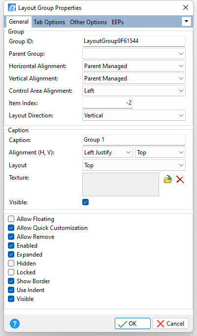
ð Group Group ID Specifies the unique identifier for the layout group Parent Group Specifies the parent group of a layout group Horizontal Alignment Specifies the horizontal justification of a layout group within its parent group. Horizontally, a group can occupy as much of its parent group client width as it can, or it can be aligned either to the right, left, or centered. •Left - a group is aligned to the left of its parent group •Center - a group is centered within its parent group •Right - a group is aligned to the right of its parent group •Client - a group occupies as much of its parent group client width as it can •Parent Managed - alignment is performed by the parent container, dependent upon the container's layout (default) Vertical Alignment Specifies the vertical justification of a layout group within its parent group. Vertically, a group can occupy as much of a parent group’s client height as it can, or it can be aligned either to the top, bottom, or centered. •Top - a group is aligned to the top of its parent group •Center - a group is centered within its parent group •Bottom - a group is aligned to the bottom of its parent group •Client - a group occupies as much of its parent group client height as it can •Parent Managed - alignment is performed by the parent container, dependent upon the container's layout settings (default) Control Area Alignment Specifies the alignment for the control within the layout group (Left, Top, Right, Bottom) Item Index Specifies the initially selected layout item in a group. Use the Item Index property to specify an item, which is by default active. Specifying the index of an item laying beyond the displayed boundaries brings this item into view. If items are organized into tabs in the group (the group's Layout Direction property is Tabbed), the Item Index property specifies the active tab. Layout Direction Specifies the direction in which the items of a given group are placed (Horizontal, Vertical, Tabbed)
ð Caption Caption Specifies the layout group caption Alignment (H, V) Specifies the horizontal and vertical justification of the layout group caption Layout Specifies where caption text appears within the group (Left, Top, Right, Bottom) Texture Specifies a texture glyph to display for the group caption, which can be loaded, deleted, and previewed Visible Specifies if the group caption is displayed
Allow Floating Specifies if the layout group may be left floating (not docked) when dragged Allow Quick Customization Specifies whether end-users can drag and drop a layout elements for the group Allow Remove Specifies whether the layout group can be removed from the control Enabled Specifies the layout group's accessibility to end-users Expanded Specifies whether the layout group is expanded Hidden Specifies whether the layout group is a hidden group Locked Specifies whether the layout group and its contents are considered as a single element during customization Show Border Specifies whether a border is drawn around the layout group Use Indent Specifies whether margins are used to separate layout group element edges from one another Visible Determines whether the layout group appears on the screen |
|