A tabbed layout group (tabbed group for short) represents a layout group whose immediate child elements are associated with individual tabs, as in a Tab Control. Clicking a tab displays a corresponding child element within the tabbed group. To programmatically activate a certain tab, use a tabbed group's Item Index property. If any tab is focused in a tabbed group, end-users can switch tabs by pressing [Ctrl-Tab] or [Ctrl-Shift-Tab].
Any group can be switched to a tabbed group and back, via the group's Layout Direction property.
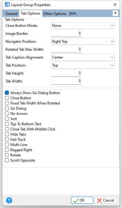
Close Button Mode Specifies the Close button visibility in tabs Image Border Specifies the width of tab image borders in pixels Navigator Position Specifies the control corner in which the navigator bar resides Rotated Tabs Max Width Specifies the maximum width tabs can have when they are rotated relative to the tab panel Tab Caption Alignment Specifies the tab caption alignment Tab Position Specifies tab panel position Tab Height Specifies the height of tabs in pixels Tab Width Specifies the width of tabs in pixels
Always Show Go Dialog Button If checked, the Go Dialog button is always visible within the navigator bar. Otherwise, this button is displayed only when all visible tabs cannot fit into a tab control. Note: This option is effective only when the Go Dialog option is checked. Close Button Specifies to display the Close Button within the navigator bar. To display the Close button in tabs, use the "Close Button Mode" setting instead. Fixed Tab Width When Rotated If checked, the width of the tab panel is determined by the maximum width of all the tabs including what is not currently displayed within the control (accessible via the navigator bar) and excluding invisible tabs. Otherwise, the width of the tab panel is determined by the maximum width of the tabs which are currently visible within the control. Note: This option is effective only when the tabs are rotated (the Rotate property is checked). Go Dialog Specifies if the Go Dialog button is displayed within the navigator bar. The Go Dialog is a drop-down window invoked by clicking the down arrow button located within the navigator bar. The drop-down window includes captions of tabs/pages available for navigation. Clicking the caption activates the corresponding tab or page. Note: When the "Always Show Go Dialog Button" option is unchecked, the Go Dialog button is displayed only if all visible tabs cannot fit into a tab control. No Arrows Specifies if arrow buttons are not displayed within the navigator bar Sort Specifies if tab captions are sorted alphabetically within the Go Dialog. If unchecked, tab captions have the same order as the corresponding tabs. Top To Bottom Text If checked, vertical text is written from top to bottom. Otherwise it is written from bottom to top. Close Tab With Middle Click Specifies if clicking the middle mouse button closes the tab located under the mouse pointer Hide Tabs Specifies whether the tab panel is hidden Hot Track Specifies whether tabs are hot-tracked when the mouse pointer is located over them Multi-Line Specifies whether tabs are arranged across several rows. Ragged Right Specifies whether tabs are stretched to fit the control's area Rotate Specifies whether tabs are rotated relative to tab panel orientation Scroll Opposite Specifies whether tab rows can be scrolled to the opposite side of a tab control |
|