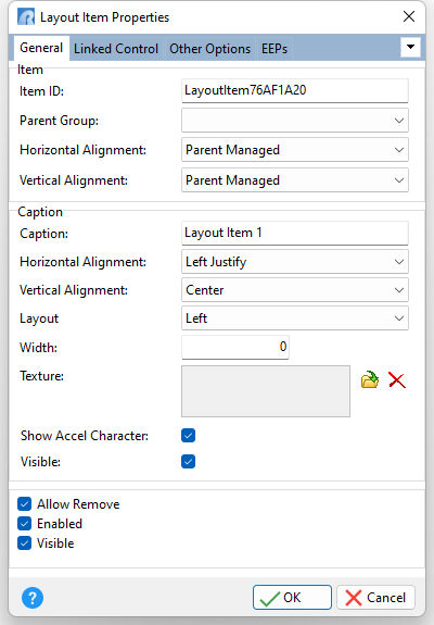
ð Item Item ID Specifies the unique identifier for the layout item Parent Group Specifies the parent group for the layout item Horizontal Alignment Specifies the horizontal justification of the layout item within its parent group. Horizontally, an item can occupy as much of its parent group client width as it can, or it can be aligned either to the right, left, or centered. •Left - an item is aligned to the left of its parent group •Center - an item is centered within its parent group •Right - an item is aligned to the right of its parent group •Client - an item occupies as much of its parent group client width as it can •Parent Managed - alignment is performed by the parent container, dependent upon the container's layout (default) Vertical Alignment Specifies the vertical justification of the layout item within its parent group. Vertically, an item can occupy as much of a parent group’s client height as it can, or it can be aligned either to the top, bottom, or centered. •Top - an item is aligned to the top of its parent group •Center - an item is centered within its parent group •Bottom -an item is aligned to the bottom of its parent group •Client - an item occupies as much of its parent group client height as it can •Parent Managed - alignment is performed by the parent container, dependent upon the container's layout settings (default)
ð Caption Caption Specifies the layout item caption Horizontal Alignment Specifies the horizontal justification of the layout item caption Vertical Alignment Specifies the vertical justification of the layout item caption Layout Specifies where caption text appears with the item (Left, Top, Right, Bottom) Width Specifies the layout item caption width Texture Specifies a texture glyph to display for the item caption, which can be loaded, deleted, and previewed Show Accel Character If unchecked, the item caption will show the ampersand (&) symbol as opposed to underscoring the next character for a keyboard shortcut Visible Specifies if the item caption is displayed
Allow Remove Specifies whether the layout item can be removed from the control Enabled Specifies the layout item's accessibility to end-users Visible Determines whether the layout item appears on the screen |
|