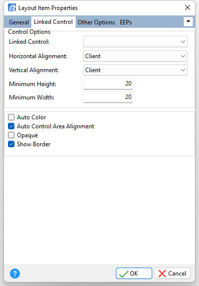
ð Control Options Linked Control Specifies the Component ID for a container control (panel, group box, etc.) to display within a layout item Horizontal Alignment Specifies the horizontal justification of the linked control layout item within its parent group. Horizontally, an item can occupy as much of its parent group client width as it can, or it can be aligned either to the right, left, or centered. •Left - an item is aligned to the left of its parent group •Center - an item is centered within its parent group •Right - an item is aligned to the right of its parent group •Client - an item occupies as much of its parent group client width as it can •Parent Managed - alignment is performed by the parent container, dependent upon the container's layout (default) Vertical Alignment Specifies the vertical justification of the linked control layout item within its parent group. Vertically, an item can occupy as much of a parent group’s client height as it can, or it can be aligned either to the top, bottom, or centered. •Top - an item is aligned to the top of its parent group •Center - an item is centered within its parent group •Bottom -an item is aligned to the bottom of its parent group •Client - an item occupies as much of its parent group client height as it can •Parent Managed - alignment is performed by the parent container, dependent upon the container's layout settings (default) Minimum Height Specifies the minimum height of a control. If the height is calculated automatically, its value will not be less than the minimum height value. The default value is 20. Minimum Width Specifies the minimum width of a control. If the width is calculated automatically, its value will not be less than the minimum width value. The default value is 20.
Auto Color Specifies whether a control inherits color within an item. If the Auto Color property is checked, the color of a control is the same as the color of the item which wraps it. Usually controls like a DB Edit or DB Memo are not auto colored (their color is Window). An example of an auto colored control is a DB Check Box. When creating an item, the Auto Color property value is automatically set and depends upon the control's Parent Color property value and Color property value (if the Color property is supported). Auto Control Area Alignment Specifies the manner in which a linked control is resized within an item. Use this property to override the layout control's Auto Control Area Alignment property setting for individual layout items. Opaque Specifies whether a control fully populates the occupied space. If the Opaque property is checked, a control fully populates all occupied space, so the Layout Manager Control does not need to draw a background behind this control. It is true for most controls such as edits, buttons, etc, but some graphic controls can be transparent, for instance Bevels and Images. In these instances, the layout control has to draw background behind these controls. By default, the Opaque property is unchecked, as it is safer since there are no problems with painting (empty space behind the controls). Show Border Specifies whether a control's border is displayed
|
|