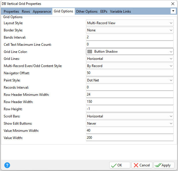
ð Grid Options Layout Style Specifies the record layout within the control •Bands View - the grid displays its data in bands •Single Record View - the grid displays a single record •Multi-Record View - the grid is able to display several records Border Style Specifies the border style for the control, as either None with no borders are drawn around the control, or Default. Bands Interval Specifies the amount of space in pixels between bands (default = 2) Cell Text Maximum Line Count Determines the maximum number of lines for cells displayed within the current view Grid Lines Color Specifies the grid line color Grid Lines Specifies whether grid lines appear vertically, horizontally, in both directions, or not at all Multi-Record Even/Odd Content Style Specifies the manner in which even/odd styles are applied to the vertical grid's content •By Row - the even/odd styles vary by row. The corresponding style is applied to all cells in each row. •By Record - the even/odd styles vary by record. The corresponding style is applied to all cells in each record. Navigator Offset Specifies the distance (in pixels) between the editing control's navigator and the horizontal scroll bar Paint Style Specifies the manner in which the tree list displays data Records Interval Specifies the amount of space in pixels between data columns (default = 0) Row Header Minimum Width Specifies the minimum width of row headers in pixels (default = 24). The setting prevents resizing the width of row headers by the user less than determined by the Row Header Minimum Width setting. The user can resize the width of row headers if Header Sizing is checked/true. If "Row Header Width" is assigned a value less than "Row Header Minimum Width" at runtime, the value of the "Row Header Minimum Width" is assigned. Row Header Width Specifies the width of row headers in pixels (default = 100). If this value is insufficient to display captions entirely then text clipping may occur. If "Row Header Width" is assigned a value less than "Row Header Minimum Width" at runtime, the value of the "Row Header Minimum Width" is assigned. The maximum value that can be assigned to "Row Header Width" is limited by the width of the vertical grid client area minus the "Value Minimum Width" value. Row Height Specifies the height of the row in pixels (default = -1). A value of -1 indicates that the height of the row depends on default settings (a row's Styles property and the vertical grid's Font, Styles, Styles Header, Styles Content, Styles Content Even, and Styles Content Odd properties). The Row Height cannot be set less than specified by the Font property. The Row Height property differs from the Height property for row fields, in that the "Row Height" affects all rows in the grid control. The Height property for row fields has priority over the Row Height property. Scroll Bars Indicates whether the control contains scroll bars Show Edit Buttons Determines the visibility of the editor buttons Value Minimum Width Specifies the minimum width of data cells in pixels (default = 40). If the value of the Band Sizing is checked/true and the Layout Style is "Multi-Record View", the user can drag the right edge of the first data column to resize the width of all data columns in the grid. In this case the user couldn't resize the data columns less than specified by the "Value Minimum Width" value. If "Value Width" is assigned a value less than "Value Minimum Width", the "Value Minimum Width" value will be assigned. Value Width Specifies the width of data cells in pixels (default = 100). This property affects the data cell width if the "Layout Style" is set to "Bands View" or "Multi-Record View" and the value of the Auto Scale is unchecked/false. If this value is insufficient to display data in cells entirely then text clipping may occur. If "Value Width" is assigned a value less than "Value Minimum Width", the "Value Minimum Width" value will be assigned.
If the value of the Band Sizing is checked/true, and the Layout Style is "Multi-Record View", the user can drag the right edge of the first data column to resize the width of all data columns in the grid.
If the Auto Scale value is checked/true and the "Layout Style" is set to "Bands View", the grid control automatically adjusts the band's width to the width of the control client area. In this case, the value of the Value Width property is ignored. If the value of Show Headers is unchecked/false, the grid control will automatically enlarge the band's width to fit the width of the control client area. In this case, the value of Value Width is ignored.
If the "Layout Style" is set to "Single Record View", the grid control automatically adjusts the data column width to the width of the control client area. In this case the value of "Value Width" is ignored. If the value of the Show Headers is unchecked/false, the grid control will automatically enlarge the data column width to fit the width of the control client area. In this case, the value of Value Width is ignored. |
|
