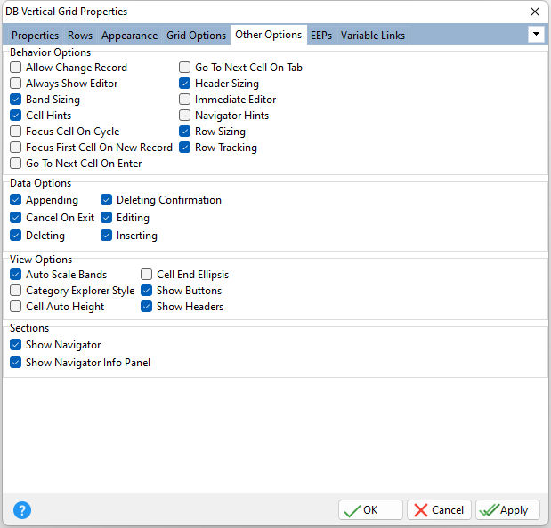
ð Behavior Options Allow Change Record Specifies whether scrolling through records is enabled. This property is in effect when the value of the Layout Style is "Single Record View" or "Bands View". If "Allow Change Record property is checked/true, the user can scroll through records using the horizontal scroll bar or left arrow and right arrow keys. Always Show Editor Determines whether the focused cell's editor is always active Band Sizing Specifies the band resizing availability. When the Layout Style is "Bands View", if the band doesn't occupy all the width of the grid control's client area (when Auto Scale Bands is unchecked/false), Band Sizing specifies whether the user can change the band's width. If Band Sizing is checked/true, the user can drag the right edge of the band to resize the band's width. Note: If the Layout Style is "Multi-Record View" and Band Sizing is checked/true, the user can drag the right edge of the first data column to resize the width of all data columns in the grid. The user cannot resize the data columns width less than specified by the Value Minimum Width property. Cell Hints Specifies whether a hint is displayed for a cell when the text does not fit into the cell's area Focus Cell On Cycle Determines the manner in which edit cells are focused Focus First Cell On New Record Determines whether the focus moves to the first cell of a newly created row Go To Next Cell On Enter Determines whether control items can be navigated by using the [Enter] key Go To Next Cell On Tab Determines whether the [Tab] key is used to navigate through the current editing control cells Header Sizing Specifies whether the user can change row headers width. If the value of the Header Sizing is checked/true, the user can drag the right edge of the header column to resize row header column width. Immediate Editor Determines whether the appropriate editor is activated immediately after an edit cell is clicked Navigator Hints Specifies if hints should be displayed for buttons displayed in an editing control's navigator Row Sizing Specifies whether the user can change the row height. If the value of the Row Sizing is checked/true, the user can drag the bottom edge of any row in the grid control to resize the desired row height. Row Tracking Enables row tracking when the user moves the mouse pointer over rows while pressing left mouse button. Row Tracking enables changing of the current row appearance and the item editor activation when the user moves the mouse pointer over rows while pressing left mouse button. If Row Tracking property is unchecked/false, just the first row that the user clicks on when starts moving the mouse pointer changes its appearance while the others retain their state.
ð Data Options Appending Determines whether a user can add a new record by pressing the down arrow on the keyboard when focus is on the last grid row Cancel On Exit Determines whether empty records are posted into a data set when the grid view loses focus Deleting Determines whether a user is allowed to delete records within a View by pressing the [Del] or [Ctrl+Del] keys Deleting Confirmation Determines whether a message box appears requiring confirmation of the user's request to delete a row Editing Determines whether a user can edit records within a view Inserting Determines whether a user can insert records by pressing the [Insert] key or via the new item row
ð View Options Auto Scale Bands Specifies if the band fills the width of all client area of the grid control. When the Layout Style is "Bands View", this property specifies the band width adjusting within the grid control. If Auto Scale Bands is checked/true, the grid control automatically adjusts the band's width to the width of the control client area. Auto Scale Bands affects the cell auto-height adjustment (which can be enabled with the Cell Auto Height setting). Category Explorer Style Determines whether to display category rows as the MS Explorer paint style Cell Auto Height Specifies whether the cell height varies according to the cell's text length Cell End Ellipsis Specifies to display an ellipsis when the entire text cannot be displayed within a cell Show Buttons Specifies whether to display expand buttons of the parent rows. If Show Buttons is checked/true, and Expand Button is checked/true, an expand button will appear on each parent row. The user can click the button to expand or collapse the parent row as an alternative to double-clicking the parent row. Show Headers Specifies whether to display row headers. If Show Headers is checked/true, row header columns will appear in the grid control. Otherwise only data columns will be shown.
ð Sections Show Navigator Specifies whether to display a controller to navigate through visible rows in the order that they are displayed on screen Show Navigator Info Panel Specifies whether to display the record number and total record count for the current dataset |
|