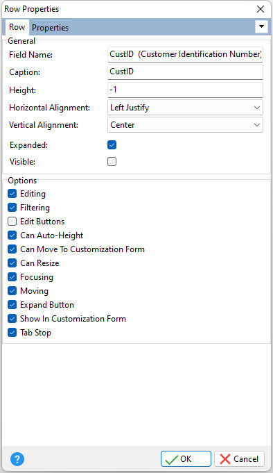
ð General Field Name Displays the field name being modified or under review Caption Specifies the card row caption Height Specifies the height of the row in pixels (default = -1). A value of -1 indicates that the height of the row depends on its content. This property differs from the Row Height property, in that the Height affects only the specified row. This property takes priority over the Row Height property. Horizontal Alignment Specifies the horizontal justification of the text within the row Vertical Alignment Specifies the vertical justification of the text within the row Expanded Specifies whether the current row is expanded/collapsed Visible Specifies if the row is visible
ð Options Editing Specifies if editing is allowed for the row Filtering Specifies whether an item displays the filter drop-down button Edit Buttons Determines the visibility of the editor buttons Can Auto-Height Specifies whether to adjust the row height to show all the text in a cell. If "Can Auto Height" is checked/true or the value of the Cell Auto Height property is checked/true, row(s) automatically change height to accommodate their content without clipping. Can Move To Customization Form Specifies whether the current row can be moved to the Customization Form. If the value is checked/true, the user can move the desired row to the Customization Form. It could be done by dragging the row header onto the Customization Form. Can Resize Specifies whether the user can change the height of specified row. If the value is checked/true, the user can drag the bottom edge of specified row in the grid control to resize this row. The property overrides the state for the specified row that was set by the Row Sizing property. Focusing Specifies whether an item cell can be focused Moving Specifies if end-users can move an item Expand Button Specifies whether to display an expand button on the row if this row is parent. If the is unchecked/false, the expand button is not shown and as such, the user's actions of expanding or collapsing are unavailable. If the above Expanded property is unchecked/false, the parent row is collapsed and the user cannot expand the parent row. If Expanded is checked/true, the parent row is expanded and the user cannot collapse the parent row. Show In Customization Form Specifies if the current row can be shown in the Customization Form. When working with the Customization Form, the user can rearrange rows by dragging them to/from the Customization Form or within the grid control. If the value is unchecked/false, the current row is not displayed in the Customization Form. As a result, the user could not rearrange this row among other rows in the Customization Form when dropped into the Customization Form. It could be done only within the grid control when the Customization Form is visible. Tab Stop Determines whether or not the column is part of tab order and a user is able to land on this field
|
|
