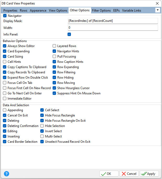
ð Navigator Provides access to the navigator Display Mask Specifies the display text format Width Specifies the panel's width, in pixels Info Panel Specifies the info panel's visibility
ð Behavior Options Always Show Editor Determines whether the focused cell's editor is always active Card Expanding Specifies whether cards can be collapsed and expanded Card Sizing Specifies whether end-users can resize cards at runtime Cell Hints Specifies whether a hint is displayed for a cell when the text does not fit into the cell's area Copy Captions To Clipboard Specifies whether or not item captions are included in the text to be copied to the clipboard Copy Records To Clipboard Enables end-users to copy the view content to the clipboard as text Expand Row On Double Click Specifies whether a category row can be expanded or collapsed when its caption is double-clicked Focus Cell On Tab Determines whether the [Tab] key is used to navigate through the current view's cells Focus First Cell On New Record Determines whether the focus moves to the first cell of a newly created row Go To Next Cell On Enter Determines whether the current view rows can be navigated by using the [Enter] key Immediate Editor Determines whether the appropriate editor is activated immediately after an edit cell is clicked Layered Rows Specifies whether an end-user can perform layering (moving items into appropriate card spaces) on card rows Navigator Hints Specifies if hints should be displayed for buttons displayed in an editing control's navigator Pull Focusing Indicates whether focus moves to the record under the mouse pointer when a user clicks the left mouse button within a view and starts moving the mouse while holding the button down Row Caption Hints Indicates whether a hint box is displayed when hovering over a row containing a clipped caption Row Expanding Specifies whether expand buttons will be visible in all the category rows that are currently available in the DB Card View. The Expanding property has priority over this setting. Row Filtering Specifies whether card rows can display filter drop-down buttons. If Row Filtering is checked/true, card rows display filter drop-down buttons, provided that their Filtering option is checked/true. Otherwise, filter drop-down buttons are not displayed within card rows regardless of other settings. Row Hiding Determines the manner in which the DB Card View's rows can be hidden from a view. When unchecked/false, rows can only be hidden by dragging them to the active Customization Form. When Row Hiding is checked/true, rows can also be hidden by dragging their captions, even if the Customization Form is not displayed. If a row is displayed within the Customization Form, it is not visible within the view. Row Moving Determines whether the DB Card View's rows can be moved by dragging their captions. In order to drag columns to the Customization Form, Row Moving must be checked/true. Show Hourglass Cursor Specifies whether to display the hourglass cursor in time-consuming operations Suppress Hint On Mouse Down Specifies whether to suppress the hint when pressing a mouse button
ð Data and Selection Appending Determines whether a user can add a new record by pressing the down arrow on the keyboard when focus is on the last grid row Cancel On Exit Determines whether empty records are posted into a data set when the grid view loses focus Deleting Determines whether a user is allowed to delete records within a View by pressing the [Del] or [Ctrl+Del] keys Deleting Confirmation Determines whether a message box appears requiring confirmation of the user's request to delete a row Editing Determines whether a user can edit records within a view Inserting Determines whether a user can insert records by pressing the [Insert] key or via the new item row Card Border Selection Specifies whether a focus rectangle is displayed around the selected card Cell Select Specifies whether individual cells can be selected instead of entire nodes Hide Focus Rectangle Specifies whether the focus rectangle is displayed around the focused cell when the control loses focus Hide Focus Rectangle On Exit Determines whether the focus rectangle is displayed around the focused record when the grid loses its focus Hide Selection Specifies whether the selected cell remains highlighted when the control loses focus Invert Select Specifies whether a single cell within the focused node or the whole node is highlighted when focused Multi-Select Specifies whether multiple cells can be selected by end-users Unselect Focused Record On Exit Indicates whether to unselect the focused record when the current view loses focus. When "Multi-Select" is checked/true, a grid view enables users to select multiple records. The focused record in this mode can either be selected or not (when Multi-Select is unchecked/false, the focused record is always selected). When a user clicks a specific record, it becomes focused and selected at the same time. If "Unselect Focused Record On Exit" is checked/true and no records are selected save the focused one, the record is automatically unselected on exiting the current view. If several records are selected, the selection of the focused record is not affected. The selection of the focused record persists if "Unselect Focused Record On Exit" is unchecked/false as well. |
|