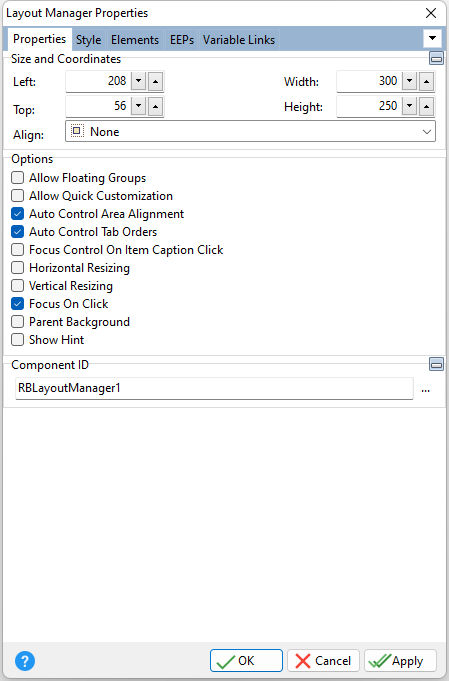
ð Size and Coordinates Left Specifies the left (horizontal) ordinate pixel of the object Top Specifies the top (vertical) ordinate pixel of the object Width Specifies the object width, in pixels Height Specifies the object height, in pixels Align Specifies the alignment of the object. The options are: None - Object can be moved anywhere because it is not aligned to the parent object Client - Aligns itself to the available client area by expanding to fill the parent object that it is in Left - Aligns itself to the left side of the parent object growing or shrinking to match parent height Right - Aligns itself to the right side of the parent object growing or shrinking to match parent height Top - Aligns itself to the top side of the parent object growing or shrinking to match parent width Bottom - Aligns itself to the bottom side of the parent object growing or shrinking to match parent width
ð Options Allow Floating Groups Specifies whether layout groups may be left floating (not docked) when dragged, and allows rearranging groups even if Allow Quick Customize is unchecked Allow Quick Customization Specifies whether end-users can drag and drop layout elements Auto Control Area Alignment Specifies the manner in which a linked control is resized within an item. When checked, this property override the property setting for individual layout items. If this property is checked, linked controls in layout items are resized automatically, so that they will be aligned to an item whose caption is the largest (widest or tallest, depending on the item's caption layout) in the layout content. Resizing is performed either horizontally or vertically (depending on the caption layout) and only for the following items:
•Items with assigned captions •Items with the matching caption layout •Items with the matching item position (i.e. only those items whose relevant edges are lined up) •Items whose alignment settings and alignment constraints correspond to the item’s caption layout
If the property is unchecked, each control is resized individually, based on its item caption.
Auto Control Tab Orders Specifies whether to automatically manage the tab order of controls within the control Focus Control On Item Caption Click Specifies whether a control can be focused when the item's caption is clicked Horizontal Resizing Specifies whether layout elements can be resized horizontally. When checked, the property overrides the Horizontal Resize property for each element. This setting is not in effect for separator and splitter items. Vertical Resizing Specifies whether layout elements can be resized vertically. When checked, the property overrides the Vertical Resize property for each element. This setting is not in effect for separator and splitter items. Focus On Click Specifies whether the control gets a focus when it has been clicked Parent Background Forces the control to follow the color attributes of its parent control, working like a transparency, in taking the parent object as the background Show Hint Displays the defined layout group hint
ð Component ID Unique identifier used when passing property parameters in statements
|
|