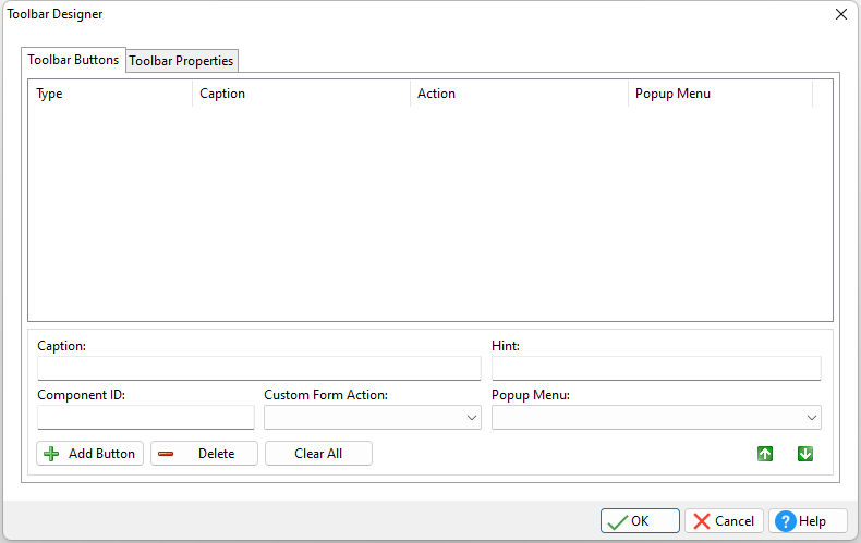
The Toolbar Buttons is the area for building buttons for a custom Toolbar and associating Popup Menus and Custom Form Actions to the buttons.
To access the "Toolbar Designer" from the Form Designer, select "Layout" > "Toolbar Designer..." from the form menu bar.
•Caption - specifies the Toolbar button text •Component ID - specifies the unique identifier used when passing property parameters in statements •Hint - specifies the Toolbar button hint •Custom Form Action- specifies the Custom Form Action that runs when the Toolbar button is selected •Popup Menu - specifies the Popup Menu that "drops down" when the Toolbar button is selected
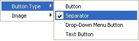
•Add Button - adds a button to the Toolbar. Button types include:
•Button - button that can display an image with or without a caption •Separator - appears as a line on the toolbar (to separate other controls) •Drop-Down Button - displays a downward-pointing arrow •Text Button - can appear with the caption only, when the "List" property is checked
•Delete - deletes the currently selected button •Clear All - clears all buttons
Notes:
•The up and down arrows move the selected Button within the list. •Buttons can be assigned images stored within the Image List Editor. Right click on the button to assign an image. •To add a separator to a list of buttons, place a new button, right click on it, and set the Button Type to "Separator".
|
|